Happy Tuesday!
Looking back through my older posts, I noticed that I’ve mentioned the importance of photo quality a number of times.
We love looking at pictures. And I guarantee the people who visit your web site love looking at pictures too.
So why would you post any photo on your blog that is less than fantastic?
As I sit here and think about that question, I can only think of four possible explanations why a photo would exist on your site that is below your standards:
- You want a bad photo out there to prove a point. Transformation projects are fun to follow, and maybe you want to show how bad the “before” was to prove a point.
- It’s the only photo you have of that particular subject, and there’s very little that can be done to improve it. Maybe it was shot out of focus, or the other photos were accidentally deleted, or you’re dependent on another photographer to take the shot — and they weren’t as good.
- You don’t know how to properly edit a photo outside of using Instagram’s filters.
- You’re feeling lazy.
Numbers 1 and 2 are what they are, and if the photo is bad there’s little you can do. You can never completely clear-up a picture that’s taken out of focus, but there are some things you try to help make lemonade out of those lemons — but that’s an advanced class we’ll do a little later.
Number 4 is something I can’t help with. If you opt to show minimal effort, understand other people blogging about your topics are working hard to outperform you. If you’re blogging for a business, and you’re using subpar photos … be ready for subpar results.
Number 3 is what we’re talking about today!
I’m only hitting high points because this topic is HUGE. You can watch YouTube videos on photo editing back-to-back for years because so many are added each day, you’re never going to be able to watch them all. (Tip: Use YouTube as a training resource — it’s pretty fantastic.)
I’ve said this before, and I’ll continue to beat this drum … you should never take a photo directly from your phone/camera to your web site without editing it first.
And we’re going to spend some time today talking about a very simple workflow for doing that. It’s a simple process, and we’re using tools that you already have available or are free to download. Unfortunately, I can’t walk through the step-by-step menu options for every software out there, so you’re going to have a little homework trying to find these options on your own, but please take the time because you probably already have these tools available.
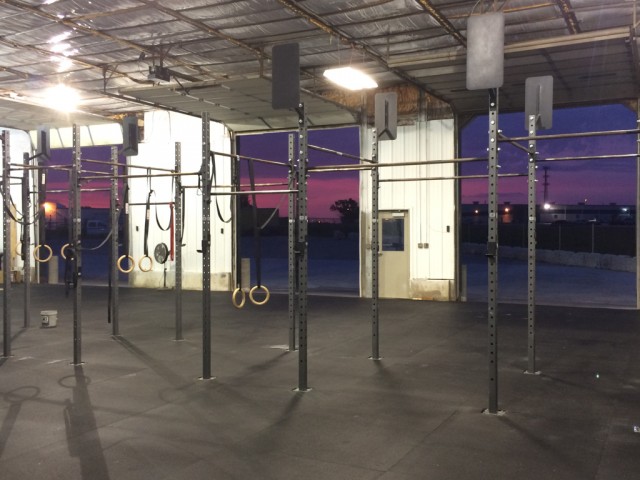
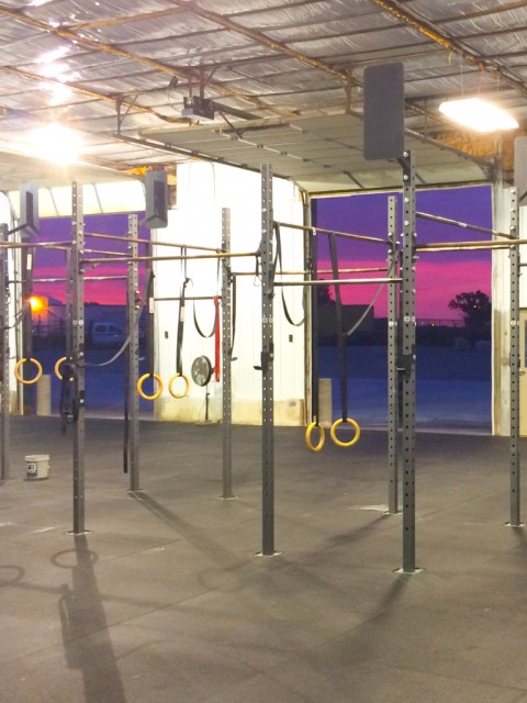
Here’s a photo I took a little while ago.
This is where I work out in the mornings: Cornerstone Barbell, Wichita, Kansas.
The other day, I was stretching out about 5:45AM, and the sun was just starting to rise, and the sky was gorgeous. So I grabbed my iPhone and snapped the photo, and I was so happy with what all this captures: the rig, the rings, the chalk bucket, the gritty (but clean) warehouse, and the stunning Kansas sunrise.
It’s a hair out of focus, but I’m still OK with it because I like the overall photo.
Dial-In the Brightness
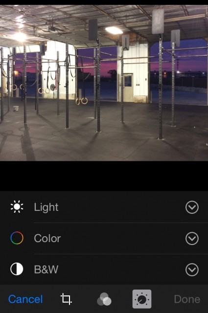 The first thing I like to do is get the brightness where I like it.
I prefer editing color and brightness before I crop anything to make sure the overall image looks right. Then, once I trim away the excess pieces, I’ll dial things in where I think they look the best.
Sometimes, this is called Brightness. Other times, it may be called Exposure. Technically, these are two different things, but for today’s purposes, they’re going to do about the same thing: make your picture brighter or make your picture darker.
On my iPhone, in the photo viewing screen, after tapping Edit in the upper-right corner, and the tapping the Dial icon along the bottom row of tweakables, both Brightness and Exposure options are on the Light menu.
From this screen, you’ll get to do all your basic edits in-phone (Brightness, Saturation, Crop, etc.). And to be honest, it’s a great utility to have because it covers all the basic needs, and it is relatively smart in how it edits (nice job Apple).
So I took the photo above, and started making things a little brighter in order to see if I liked it.
I did.
Once I had the brightness where I liked it, I decided it was time to move on to the next step of my workflow.
Play With the Saturation
I was pretty happy with my photo at this point, but I wanted to give it a little more oomph, so I went to the Color menu on my phone and started tweaking the Saturation.
What this does is take all the colors, and makes them deeper. Sometimes this works, and sometimes it doesn’t — it sort of depends on the look you’re going for.
After moving the slider a bit, I loved how it made that sunrise pop. It brought out some great hues of pink and purple.
I’m pretty pleased with that, so on to the next step.
Crop It Like It’s Hot
OK, so the original photo has been tweaked, and I’m pretty happy with the brightness and color. Now it’s time to get the focus where I want it.
There’s a general rule in photography called the “Rule of Thirds“. Basically, it says that if you draw a Tic-Tac-Toe board on top of your photo, dividing it into thirds vertically and horizontally, everything important should be along those lines.
Generally, this is a great rule to shoot by. In fact, if you go into your camera settings and tell it to add grid lines, it adds lines at 33% and 66% to give you the proper points of reference for following the rule of thirds.
But here’s the thing … that’s a great rule to practice when you’re able, but sometimes it’s either not possible (like when you’re featuring a piece of furniture that takes the entire frame), or it’s just not that important for the photo.
But when you crop, think about the rule of thirds, and see if you can align important points along the 33% or 66% lines.
Also, cropping is used to simply remove the dead space. Fill the frame with important stuff, not empty area.
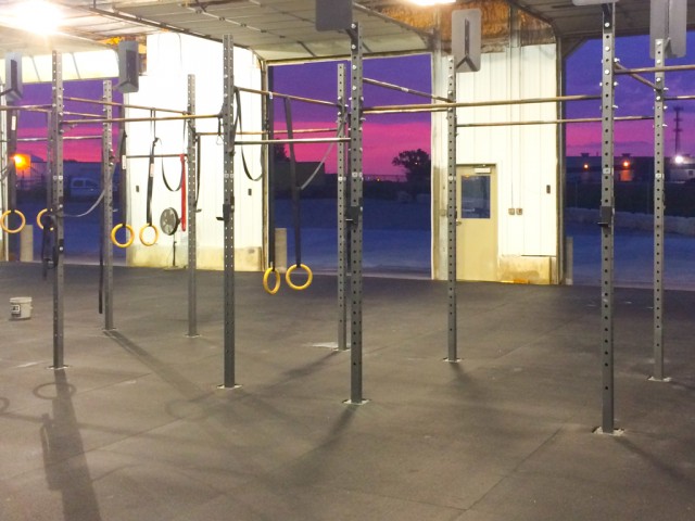
For my photo, I tried a couple of different cropping options. For one, I turned it portrait to get some neat shadows, and for the other, I kept it landscape to get more of the sunrise.
It was a tough call, but liked the image with more sunrise.
Fine Tune
The next item in my workflow is warmth. This is a slider that turns the image more blue or more yellow, depending on where you go. I don’t have this on my iphone, so I used a program on my Mac.
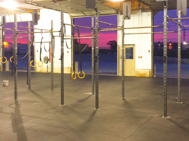
For this image, I cranked-up the yellow a bit. I tend to associate a gold hue with early morning (I blame with Robert Frost, or The Outsiders … not sure which), and I wanted the inside of the gym to have a nice warm feel to it.
So I leaned on that dial a bit, and I LOVE how it came out.
Resize
My last tip is to resize it … and you may need to do that in another program — thankfully, WordPress allows you to do that when you edit an image from your admin panel.
I typically try to stick close to 1024 x 768 (or vice versa if you want the other orientation).
Resizing is an important step! It helps control your web page size and how quickly it loads. We’ve all been to those pages that have huge photos, and you watch it, in slooooowwww mooottiiiooooonnnn, line by line, fill the page.
Don’t be that person.
And here’s the beauty of this workflow … it took about three minutes.
That’s right. I didn’t spend hours laboring over it. I simply tweaked it, and went on.
That’s all I want to hit on today.
That’s the quick, down and dirty way of improving your photo output.
But practice. Practice. Practice. Practice.
Practice editing your photos. And definitely practice taking your photos. If you want to improve, you have to practice. It makes a difference.
And trust me … this barely scratches the surface of photo editing. Please take my advice above and spend some time in YouTube watching people edit photos, you’ll learn so much!
So you’re looking for some tools to help you? Here’s a short list:
- Use the Photo app on your phone. It’s built in and pretty intuitive.
- One of my favorite free photo editing programs is Irfan View (Windows). It’s free, has a small footprint, and does a TON to help you edit your photos in one handy program.
- If you’re a little more savvy at photo editing, or you’re looking for the next step, check out a couple other free options: GIMP (Windows or Mac) or Paint.net (Windows). Both of these are FANTASTIC! But they come with a hefty learning curve; however, once you learn your way around, though, you’ll love them!
- If you don’t mind shelling out some money, you have even more fantastic options. Personally, I love Adobe Lightroom. I’ve used a lot of photo editing software over the years, and Lightroom is by far the best I’ve found. Hands down.
Next time we talk about photos, we’ll go a little deeper down some rabbit holes.
Until then, feel free to check out some of my other posts on blogging.
Have great day!!!
 |
 |
 |
 |
 |
 |
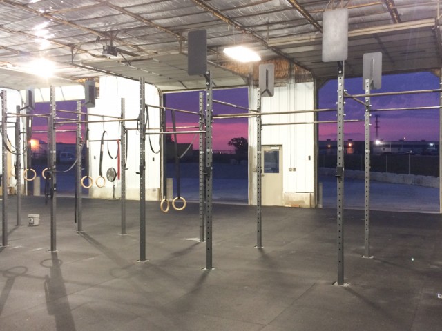

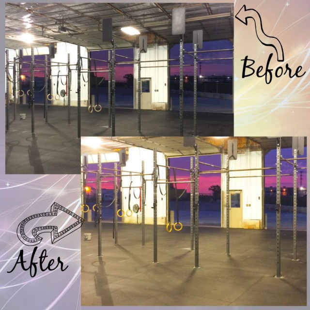
Great information, Topher! And your demo photo is spectacular. In the before pic, I could barely see the sunrise. The after pic shows the sunrise to perfection. Well done!
Thank you Marcia!